
Let’s face it. Mozilla puts out a lot of alphas, nightlies, and developer releases, so if you’d ignored last month’s offering—Firefox 3.6 alpha—you could probably be forgiven.
However, this time there were actually some good reasons for web geeks to pay attention. Among other goodies, the new additions include support for:
- the
-moz-background-sizeproperty - multiple background images
- the
remlength unit - CSS gradients
- improved
display:tablerendering
So, let’s take a closer look at a few of the headline-grabbing features.
Multiple Background Images
Although there was a little buzz generated when Mozilla first introduced -moz-border-radius—giving you simple CSS rounded corners—I personally remember finding the effect a little underwhelming at the time.For me, the concept of multiple background images was always going to be the killer feature—allowing us to do some awesome tricks with layout sans the need for superfluous markup to hang it all on.
The basic syntax is a no-brainer. Instead of listing a single image source for your background-image property, you list up to a maximum of four comma-separated images.
You can also specify up to four values for the respective
background-repeat and background-position properties:#multi {
background-image:url(paper.png), url(paper2.jpg);
background-repeat: no-repeat, no-repeat;
background-position: top left, bottom right;
}I have to say, I did find the stacking order to be slightly counter-intuitive. The second listed image tucks underneath the first image, and so on. But as long as you’re aware of this it’s no problem.


At this moment, multiple background images are only fully supported in Safari 4.0, Chrome 3.0, and Firefox 3.6 alpha (Minefield). You can see my example in action by pointing any one of those browsers at this URL:
http://www.sitepoint.com/examples/css3/multi.html
So, is this worth using today?
One of the first problems I hit with sending this code to other browsers, is that they reject just taking the first image and ignoring the others. The comma is enough to kill the whole declaration in those browsers, leaving the background blank.
However, I found (nod to @shaynet) that as long as you first declared the background-image in its standard, single-image format, Opera and older versions of Firefox and Safari were perfectly happy to simply ignore any newer CSS code that follows.
And although it’s true that Internet Explorer refuses to play along, we’re free to use conditional comments to send the simpler, single-image code to IE like this:
In short, I think this feature is usable and worthwhile today, but you are going to need to be mindful about using it gracefully.
Make sure your design works nicely with older browsers (you’re no worse off than before, after all) but inject an extra layer of richness for an increasing base of users with these newer browsers. The time to start experimenting is now.
Background-size
As you might guess,background-size allows you to scale the CSS background imagery you’re using. 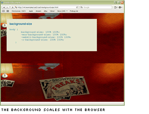
Currently
background-size lacks support anywhere in its pure CSS3 format, but each of Opera, Chrome/Safari, and the Firefox 3.6 alpha support it with their own custom markup.That markup looks like this:
body {

 background-image: url(background_image.jpg);

 background-size: 50% 50%; /* w3c spec */

   -moz-background-size: 50% 50%; /* firefox css*/

   -webkit-background-size: 50% 50%; /* safari/chrome */

   -o-background-size: 50% 50%; /* opera css */

}
If you’re using any of those browsers you can see that code in action here.
So, can we use this now?
Again, the short answer is yes. Proprietary controls like these will always be ignored by other browsers, so there are no technical issues with using it.
For me, it’s simply less clear exactly where I’d want to use this property, since the rescaling process is rarely kind on the imagery.
So, if you can mock up an attractive example using this feature, I’d like to see your work.
CSS Gradients
The CSS background gradients feature seems to me to be the most viable new aspect, even though currently it is only supported in the Firefox alpha, Safari 4, and Chrome 3 browsers.Like the
background-size code this is browser-specific code, although each team introduces a new value for the standard background-image rather than creating an entirely new CSS property.At its simplest, it looks a bit like this:
div#cssgradient2 {

 background-image: -moz-linear-gradient(top, bottom,from(#A1D004),to(#6B9A00));

 background-image: -webkit-gradient(linear, left top, left bottom,color-stop(0.00, #A1D004),color-stop(1.00, #6B9A00));

}
As you can see above, the Mozilla (Firefox) and WebKit (Safari/Chrome) code is similar but not identical. Both require start and end colors for your gradient, as well as directional coordinates (that is, top, left, right, bottom, and so on).
While both WebKit and Mozilla can do radial and linear gradients, they handle the process slightly differently. Where Mozilla prefers to use two separate property values (that is,
-moz-linear-gradient() and -moz-radial-gradient()), WebKit uses a single property value with an extra parameter (for example, -webkit-gradient(radial,…)).To keep it simple, I’m going to stick with linear gradients today.
While CSS gradients always require a minimum of two colors to work, both methods allow you to set multiple color waypoints that your gradient will transition through.
The syntax for a rainbow gradient would look like this:
/* fallback */

background: #F66 url(rainbow-gradient.jpg);


/*mozilla gradient*/

background-image: -moz-linear-gradient(left, right,

 from(red),

 color-stop(16%, orange),

 color-stop(32%, yellow),

 color-stop(48%, green),

 color-stop(60%, blue),

 color-stop(76%, indigo),

 to(violet));


/* webkit gradient */

background-image: -webkit-gradient(linear,

 left top, left bottom,

 color-stop(0.00, red),

 color-stop(16%, orange),

 color-stop(32%, yellow),

 color-stop(48%, green),

 color-stop(60%, blue),

 color-stop(76%, indigo),

 color-stop(1.00, violet));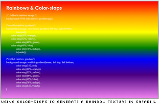
Interestingly, IE can also do a reasonable job with simple gradients (which excludes rainbows) using a filter property that has been around since the days of IE5.
The IE-friendly syntax looks like this:
filter: progid:DXImageTransform.Microsoft.gradient(

 enabled='true',

 startColorstr=#A1D004,

 endColorstr=#6B9A00,

 GradientType=0

);
There are two things you need to know about this code.
Firstly, yes it’s ugly, but you can see where the start and end colors are being set.
Secondly, believe it or not, the obscure
GradientType parameter in fact sets the direction of your gradient. Set it to 0 for a vertical gradient and 1 for horizontal. As far as I can tell, it’s impossible to do diagonal gradients or color-stops with this filter in IE.As I see it, there are three real attractions to using CSS gradients.
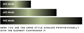
- Unlike images, CSS gradients scale proportionately with the element containing them, allowing them to expand and contract depending on the amount of content.
- CSS gradients are very efficient, allowing you to generate large, flexible, textured areas of tone with only a few lines of code. That translates directly into faster pageload times for your users.
- There are plenty of situations where images may be blocked by the user for security or bandwidth reasons. CSS gradients will increasingly give you complex tones places that images can’t go or aren’t wanted—arguably most importantly, on Safari on the iPhone.
So, can we use it now?
Again, as long as you’re sensible, the answer is yes.
Clearly the newest versions of Safari, Chrome, and Firefox have good gradient support. IE provides passable gradient support. That represents roughly half the browser market before the feature has been introduced to the main Firefox release.
The remaining browsers can be given a garden-variety background image, which is exactly how you would be handling gradients now anyway.
Summary
It’s easy to mount a counter argument against using new browser features—it’s always too early and the technology is too young. However, you need to play with any tool to become skilled with it, and gradients and multiple backgrounds are going to be the front-end developers’ bread and butter in the years ahead.I think playtime starts now.
0 comments