
Photoshop.
Step 1: Setting Up
Make a new document with these settings:
Setting Up
Setting Up

Next, select the fill tool (G) and fill it with #626262. Now, we need to make a new adjustment layer. Make a brightness/contrast layer (Layer > New Adjustment Layer > Brightness/Contrast). Put it on these parameters.
Adjustment Layer Parameters
Adjustment Layer Parameters
 We add this adjustment layer so as everything looks better in the later stages.
Step 2: Making the Circle
Select the circular marquee tool and use these settings:
 This is so that it looks more 3D, and later on, it’ll add a nice transparent feel to our icon.
When you’re happy, and you have a similar result to the one above, add these Layer FX to it, to make it look better.
 You should now have something resembling this:
 Step 3: Making the Circle 3D
In this step, we’re going to make the circle look 3D. The theory of this is simple. You think about where the light is coming from, then add shadows and highlights to fit your light source if you keep this consistent, then you’ll have a much better final result. Below is some light theory that should make it easier for you.
 Lighting
Although this is not the best of diagrams, it shows basic lighting. If you stick to this, and have a constantlight source, your piece will turn out far more striking and realistic.
OK, grab your circular marquee tool, set it to 10px Feather and make it 200px by 200px. There are many different ways of getting highlights/gloss and shadows. My favourite, and I think one of the best ways to get gloss is like this.
Change the layer mode to multiply
 And then, with white as your foreground colour, add this Layer FX
 Vary
VaryYou can vary this. When making your highlights, you can vary the opacity, or colour of the gradient you use. You can also vary the layer mode. Try changing some settings now, and see what happens!
Shadows are much easier to make, and in a way, more powerful. You can have more highlights than shadows, because shadows are more obvious. For a shadow, simply make a circle, you can vary this and the feather px. Then, you can set it to soft light, overlay or of course, normal, it really comes down to which one you like best.
With the shadows, you can make them very discreet, yet they still play a very important part in the eventual outcome of the icon. Highlights are less noticeable, so you can add more of them, but with shadows, they play a bigger part; and have more of an impact.
The worst thing you can do when shadowing is zoom in too far. When you do that, you can’t see the whole image, and so you can’t really tell if it looks right. Make sure that when shadowing, you can see the whole image, and you’re thinking about what you’re doing!
By now, you should have a well highlighted and shadowed 3D sphere, resembling this. Don’t worry if it looks a little strange at this point, it’ll all come together later on.
 Step 4: Adding Detail
Now, that looks OK. I added some highlights on the right that add a lot; I used the highlight technique described above. In this step, we are going to make those really nice 3D looking lines. The way to do this is simple, which we’ll find out in a bit.
Select your pen tool and get a brush size of 3px wide. You want to use these settings for the pen tool.
 Set your brush size to around 3 – 5pxNow, for PC users, press right click > stroke path, for Mac users;CTRL + click > stroke path. When you stroke paths, there are two types of stroke paths. With simulated pressures and without simulated pressures. Here is an example of both.
 If it doesn’t work, you may need to reset your brushes here’s how to do that:
 In the next step, we’ll work out how to make these lines aid the 3D look.
Step 5: Detailing the Detail
You probably have some white lines now, looking 3D, but not merging into the icon. Set the layers tosoft light or overlay, you can also lower the opacity and/or the fill of the lines. You can also get a soft eraser to erase some areas to make it look more 3D.
If you look carefully, you will also see not only the very distinct circles, which I’ll tell you how to do later; but also the very faint ones. To make both of them, grab the circular marquee tool with these parameters:
For the faint ones, but it below every ‘line’ layer, and set it to soft light or overlay and lower the opacity.
In the next step, we’ll make 3D paths, that really add to the image.
Step 6: 3D Paths
Step 6: 3D Paths
This is a really short step, but it adds a lot.
Firstly, get your pen tool open, and then follow these steps.
 Experiment
Try out different paths and set some layers to soft light or overlay and lower the opacity.
Step 7: Making the Basic Box
Step 7: Making the Basic Box
If you want to have something to trace around, you can do so around here. But of course, if you want to make your own, go for it! When you’re tracing, use the pen tool, and make each side on a new layer. Then, fill the paths with white (#ffffff). Then add these layer FX to every side.
On the ‘front’ sides, set the fill to 15% and the ‘back’ sides to 10%. This’ll get it looking transparent.
 Step 8: Highlighting the Box
Remember that highlight technique earlier? Well, use that technique on paths like this. Make a new layerabove each box ’side’ and then make a path accordingly. To make ’swirly’ paths, make two points, then; click in the middle of the path and drag it up/down left/right and it’ll make a nice path. Have a look at this example.
 Then, select the right ’side’ layer and press CTRL + SHIFT + I or for Mac users CMND + SHIFT + I, then press delete. In the next step we will look at adding more detail into the box.
Step 9: Adding Details to the Box
In this step, there’s not going to be much writing, more annotated pictures. I am using the techniques for stroking paths, highlights and shadows that we looked at earlier to make the box, and anything you seen in these pictures.
 Making Softer Shadows
If you want to make those soft shadows, get a soft brush (airbrush) around the size of 9-12px, stroke the paths and then lower the opacitysoft light.
Step 10: Making Everything Glow
Step 10: Making Everything Glow
That looks good, but… Not full of that striking glow. To get something to glow, it’s really easy. Simply get an airbrush, 100-300px and just paint on white. For background highlights, make new layers at the bottom and highlight there. For more centralised ones, do it on top, and maybe in a smaller brush.
To get a better glow-type look, adding lots of layers on 5-10% opacity will look much better than two or three on 40%. You can also add blue highlights to give it more of a glow.
 Step 11: Finishing Details
The icon looks good, but it’d be nice to add a bit more shadow. Make a new layer at the top (behind your contrast one) and fill it with black (#000000) and set the fill to 0%. Then add these layer styles and you have a nice shadowed look.
 And you’ll have a nice shadowed look to your image.
Conclusion
In this tutorial, we’ve learnt about strokes, layering, shadowing, highlighting, layer FX, layer modes,opacity and fill. Put together you can make so many amazing things in Photoshop, so good luck; and make sure you check Tutorial9 frequently for tutorials!
I hope you enjoyed creating your own internet icon!
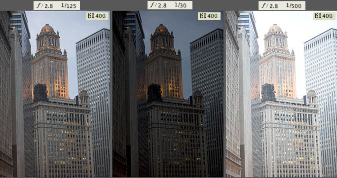
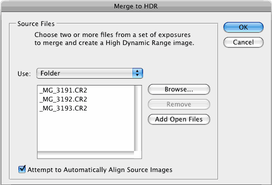
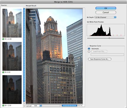
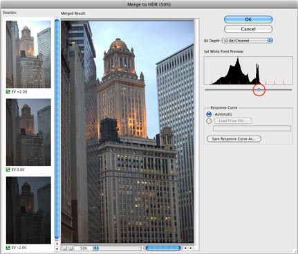
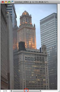
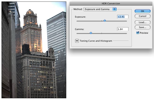
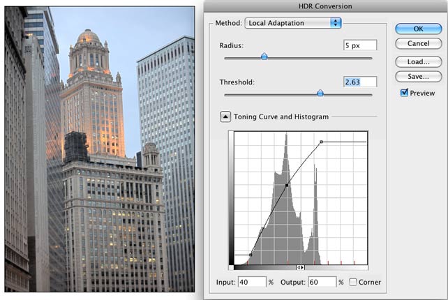
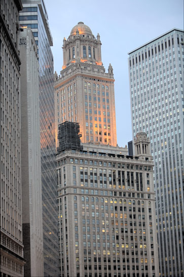
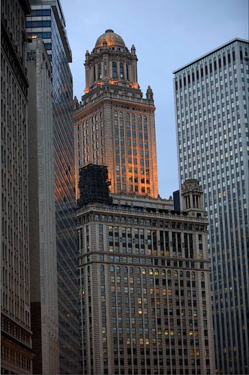

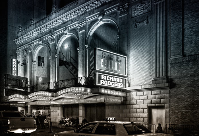 Here is another HDR shot of mine. This is a night scene converted to grayscale.